MyShake
Achieved a 40% increase in user engagement by evolving MyShake into an all-in-one earthquake care package.
App's redesign set to launch in 2026 🚀.
Role
Product Designer - In charge of user interviews, ideating, visual design system, and prototyping.
Team
5 Product Designers
1 Project Manager/Developer
Design Skills
Figma, Figjam, Google docs, Product Strategy, Design Systems, Accessibility Design, User Research
Type
Contract, Feb 2024 - Apr 2024
Existing Screens


Overview
Problem
The current app feels outdated—poor onboarding, confusing navigation, and low engagement leave users with no reason to return.
Goal: improve usability and sustain weekly active users.
Solution
Redesigned MyShake into a full earthquake preparedness platform including: new design system, clearer information architecture, customizable dark/light modes, gamification of the education page—driving higher retention and activity.
Have you ever been concerned over your loved one's safety during an earthquake?
What is MyShake?
Earthquakes are a universal concern. MyShake is a mobile app that provides real-time earthquake alerts and safety information to help users prepare for and respond to earthquakes.
As of now, the current app has…
outdated UI, the user engagement is low, and it has inefficient navigation.
Goal -
MyShake currently has 3.8+ million users and only 5% are active. We aim to have 4 million users with around 500k active users actively engaging with the app.
Our client mentioned…
our job is to make MyShake the #1 earthquake app on the market.
First step: What do users expect to see on an earthquake app?
Breakdown of next steps
01 Identifying landing page user needs
What specific features do users expect to see?
02 Increasing user retention
What will make a user come back to the app?
Researching our competitors to find ways we can compete and stand out within the market.
We started a competitive analysis to find what users liked in other earthquake apps and ways we can find improvements. Our focus was on improving user satisfaction by refining the user experience and integrating key features from other apps.

Takeaway 01
Prioritizing simplicity in UI and prevent information overload.
Takeaway 02
Utilizing half-screen and half-map UI.
Takeaway 03
Intuitive and relevant organization and navigation
I conducted 5 user interviews with individuals who do not use an earthquake app. The focus was on identifying their priorities and needs during an earthquake event.
User Interview Takeaways
Priority 01
Personal Safety
Priority 02
Family Safety
Priority 03
Property Damage
User Survey (50+ people) Takeaways
Features
Earthquake Tracking, Information Access, Reporting
Expectations
Early Alert, Safety & Communication
Dislikes
Poor UI aesthetics, the confusing "I felt shake" button, lack of color on the map.
So now we know what features are prioritized, what's next?
Using our user research takeaways, we can now decide what features are essential for the landing page. We designed two landing page variants based on user feedback.


Essential Features to Include
Feature 01
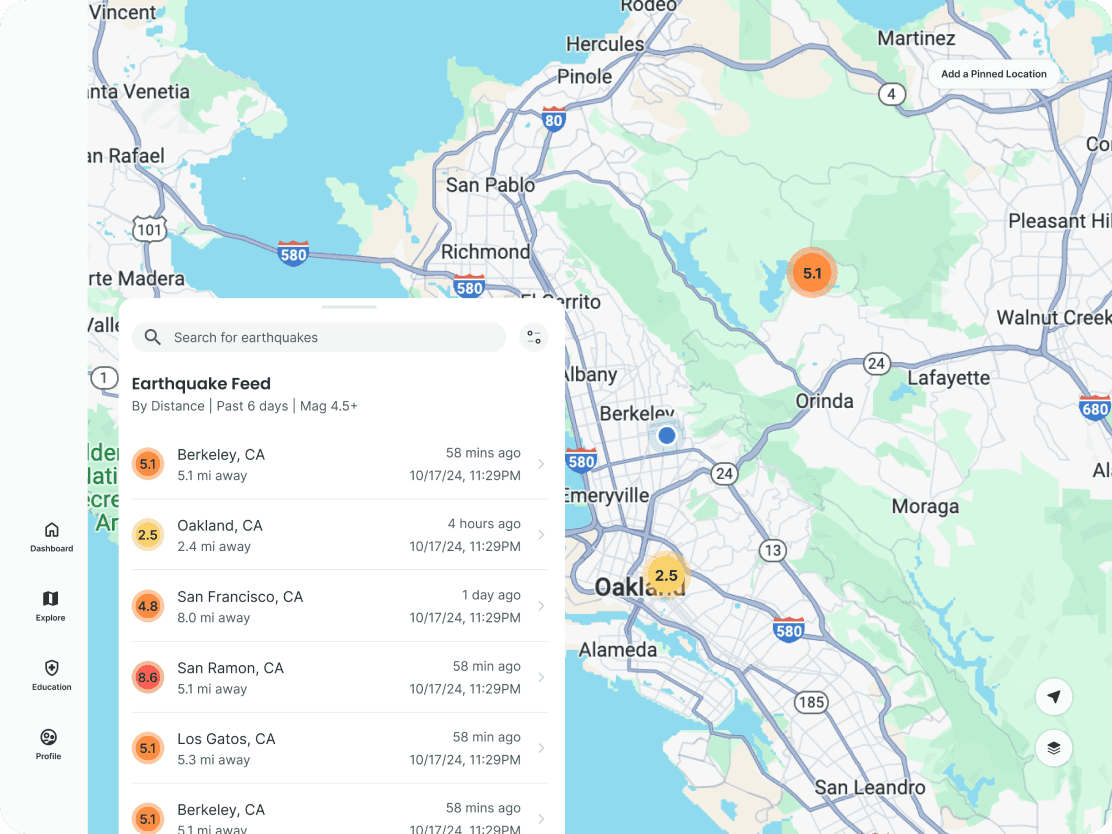
Map appearing first, showing nearby earthquakes to you.
Feature 02
Pinned locations to check on loved one's earthquake-prone locations.
Feature 03
Easily accessible safety information on what to do during an emergency.
The Debate between 2 Variations
Variation 1
Half-list + Half-map Landing Page
Variation 2
Bento style Dashboard (Uber Inspired)

We conducted A/B Testing, to find that users did like the all-in-one dashboard more.
Information Architecture
Reorganizing a more organized flow.

We got approved for version 2!
After discussing with our client and presenting on our findings to verify if this was possible, and they agreed that they liked this layout of a dashboard. It includes easy access to necessary features and prioritizes user pain points.
User Needs Covered Through Features of V.2 Dashboard
Safety First!
Nearby earthquakes, Pinned locations First, Movable Map prioritizing loved ones and yourself, Damage Reports.

Safety and Education
Safety Information letting users know what to do in an emergency. Education offers gamification increasing engagement.

Why is this good?
Accessible
All necessary features on dashboard. It will be an all-in-one earthquake care package.
No hidden features
We improved navigation, a user can click on the map view and check loved one's locations quick.
Emergency Ready
Users get access on what to do during and earthquake and get resources after on how to recover.
What we are leaving behind.
Help Page
Removed the (redundant) Help page, all information can be accessed on their website FAQ.
Design System
I designed a new branding system to modernize and make it more visually pleasing and complies to WCAG.


Welcome to the new MyShake, your all-in-one earthquake care package!

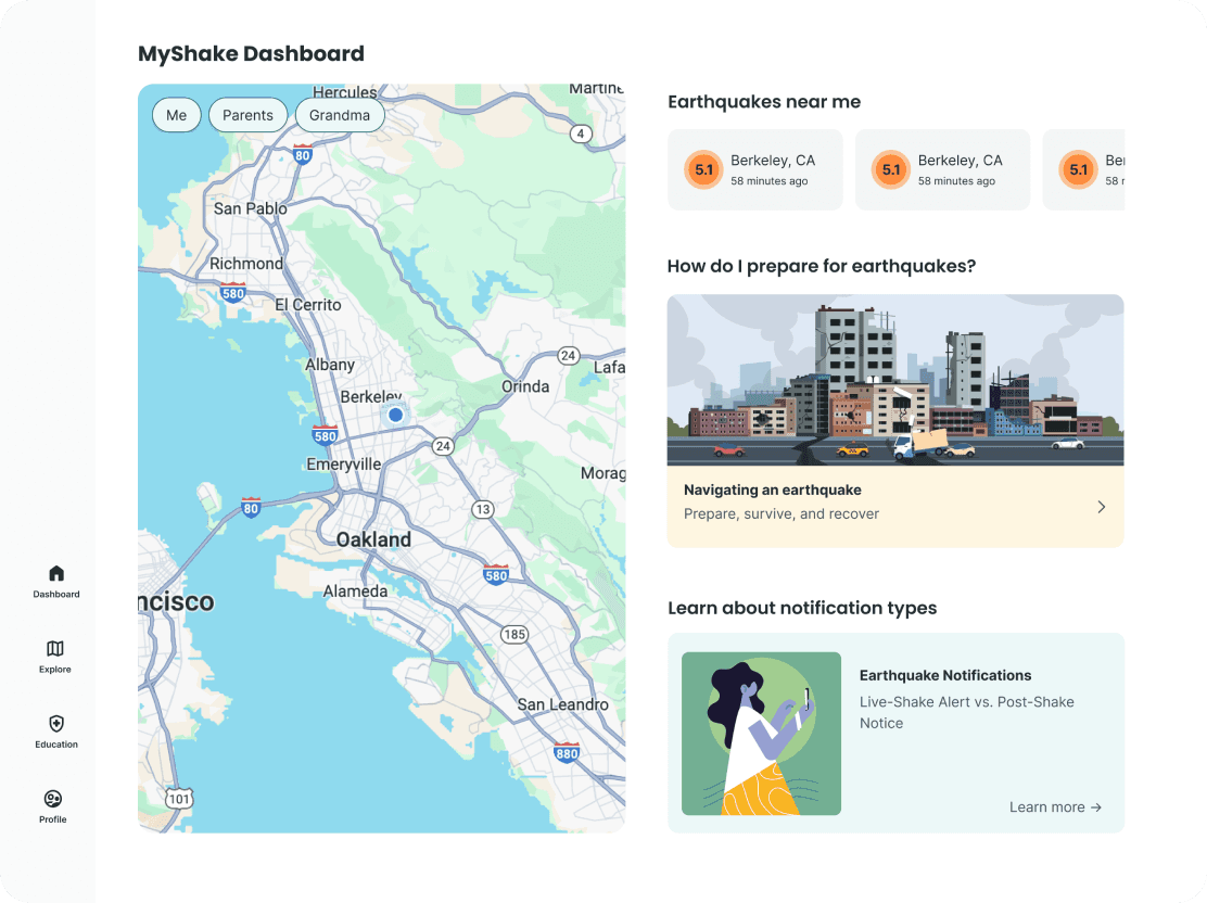
MyShake is now a comprehensive earthquake app that targets all critical information on your dashboard. Pinned locations will be at the top where user can easily view loved one's nearby earthquakes.
How does this answer the problem
Improved Navigation
Our dashboard now includes the most important information based on user feedback
User Engagement
Added gamification and educational resources on the education page for increased activity.
Updated Design System
MyShake is now a warm and authoritative app that will welcome all users.
Dashboard
Landing page with all your needs.

Dark Mode
Users have the option to turn dark mode on the profile page.


Let's reflect…
This was one of my favorite projects to work on as my team and I were really invested in making MyShake the #1 app in the market. I learned a lot and had a lot of fun through late nights working with the team.
Some key takeaways from my time with MyShake was design advocation. While our client denied to research their users, I pushed that we conduct user interviews, user surveys, and a competitive analysis to fully understand our scope. Sometimes, a client may not know what is best for the design. In the end, the research benefitted us a lot in understanding what were a user need.
My Takeaway's
Design Advocacy
Communicating design decisions to ensure product meets user needs.
Narrowing Research
I learned to choose research methods based on the goal or focus.
Balance needs
Trying to balance user and business needs could be pretty challenging.

If we had more time…
I would love to conduct more research at a larger scale. I would also want to look more into the expansion of adding an earthquake news feature as it could help MyShake be that all-in-one place to find information fast. With the extra time, I would design more micro interactions as well to contribute to the overall UX.